Giving power to the AirQo search feature
In this post, we share our thought process on re-imagining the functionality of the AirQo mobile app search feature from a UX perspective.
Collaborators; Jason Mukasa, Paul Zana, Luyima Hakim
The UX team at Airqo was tasked to re-imagine the functionality of the mobile app search feature from a UX perspective.
Precedent🌪
Currently, the search icon is located in the top right corner of the app screen and opens out an almost blank search page for users to perform a “search”.

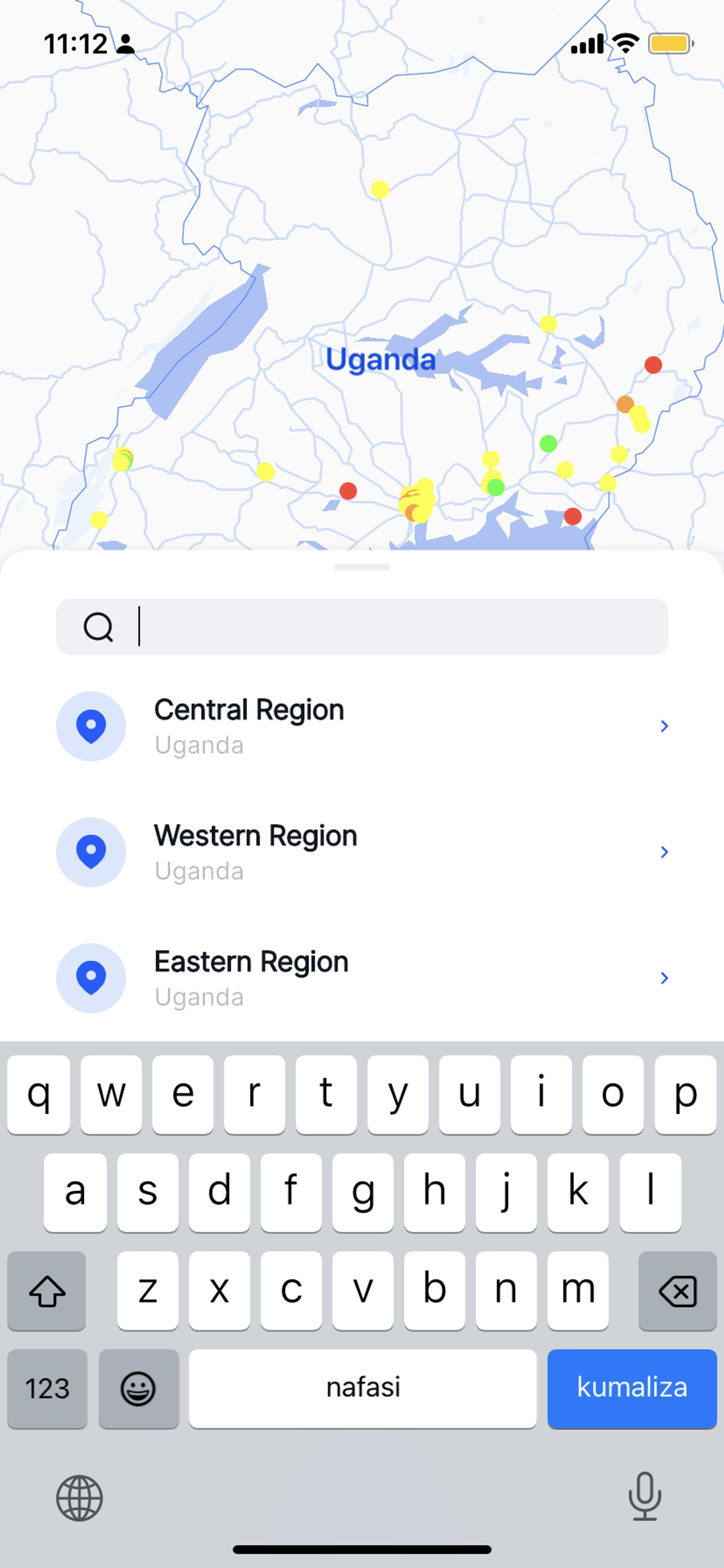
Users currently can also search for air quality using the “AirQo” Map. The search is guided by filters that divide the country on a regional basis. i.e Central, Eastern, Western, and Northern regions.

Our approach🧶
We decided to utilize the Lovable Product Framework(LPF) that helps us design products that people love to analyze the current frictions of the search function. There are 4 key criteria under this framework: speed, customer orientation, awareness, and expectation. Here is a summary of the framework.
I. Speed — how quickly can you get the job done?

Have you ever been stuck because you are waiting for someone else to reply? It’s very frustrating. Users don’t like being powerless, users don’t like to be stuck. Users only care about the results. You get their job done quickly, and they’ll be returning soon enough.
II. Expectation — how much value do I get from the product?

Well-known fact: our brains are wired to expect the outcome. When reality falls short of the expectation, we suffer. When reality equals our expectations, we are satisfied. When reality exceeds our expectations, we are amazed.
III. Customer orientation — whose side are you on?
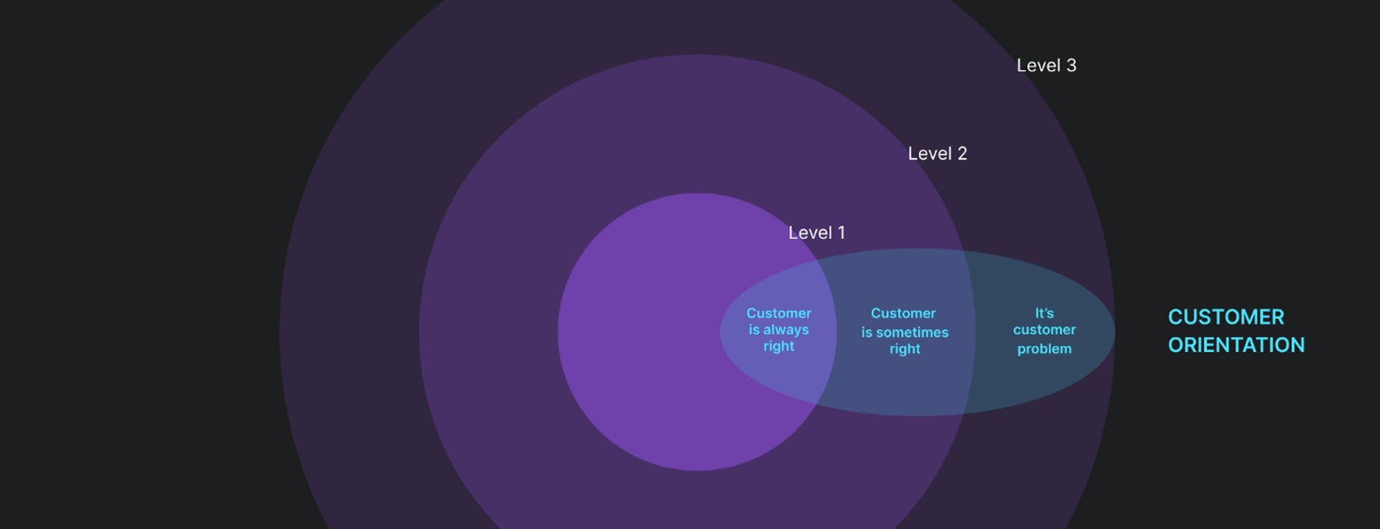
Products fail their users from time to time — it’s okay. Be that because of a bug, glitch or an honest human mistake — the product as well as the brand are put to test when things go sideways. Did the courier fail to deliver your order? Subscription payment went through multiple times? What will you do when the user asks for your help and support?
IV. Awareness — what’s going on and how is that helpful?

What do new Miro and Robinhood users have in common? They usually have little idea of how to use the app when they first launch it. Your users won’t know what’s going on and what to expect until you let them know. This issue is often overlooked, however, the impact on user experience here shouldn’t be underestimated: as a user, I don’t care that “Something went wrong” or that my form application is complete — I need to know what exactly should I do now and what should I expect next.
An in-depth walkthrough of how we applied the Lovable Product Framework
🌈#1 Two ways to do the same thing, which one is better?
Upon further investigation of the application and user interviews, we were able to realize that the primary function of the search feature is to search for locations which can be done in two ways through the mobile app.
So, the key frictions are;
Speed. An extra step lengthens the user flow.
Expectation. There is an expectation that the system should not make the user think of how to complete a task. Case in point, “I can search for locations here, so what does this other one do?”. This leads to an unnecessary cognitive load.
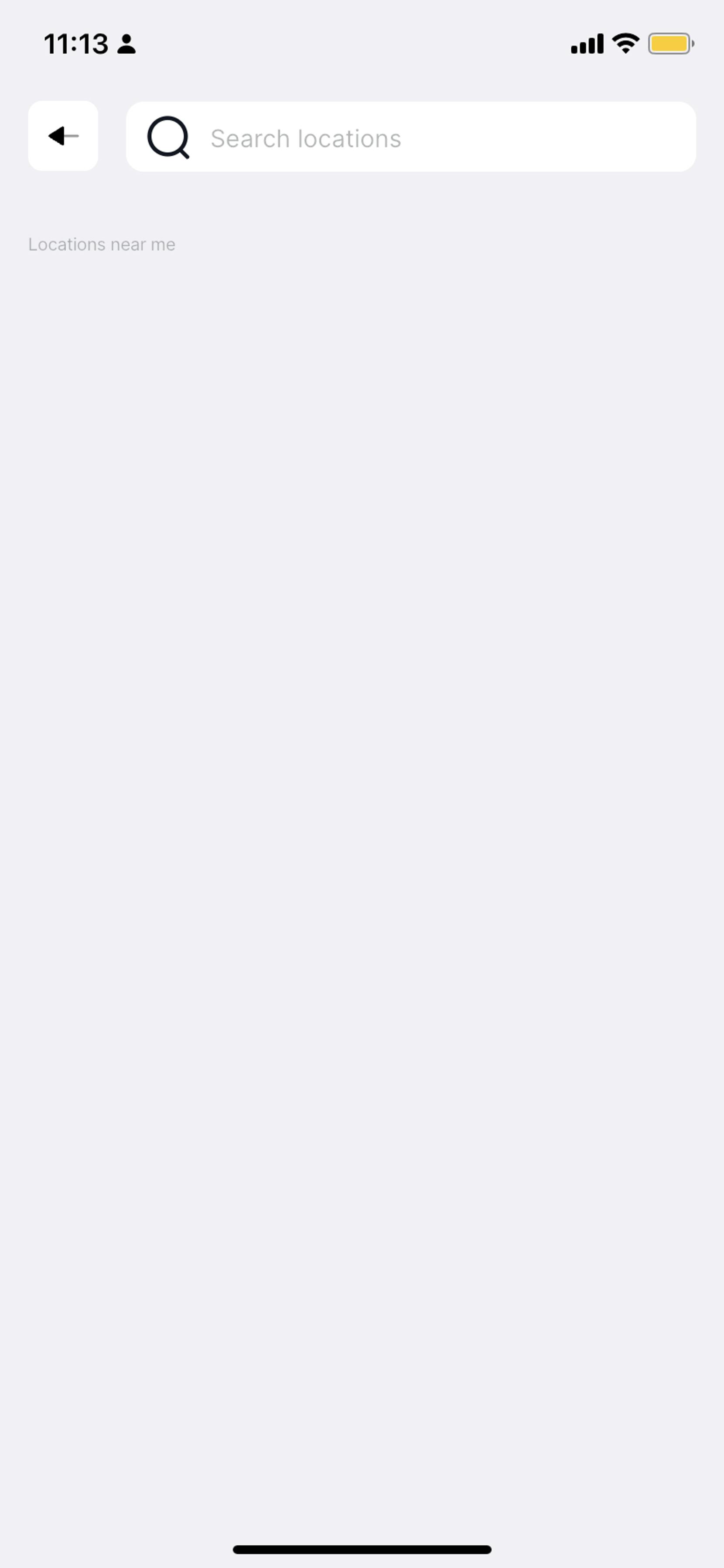
🥶1.1 Cold searches for a location
Fig 1.0 Cold searches for a location

#Pros
❤️ It’s direct and easy to interpret
❤️ It’s familiar and properly placed.
#Cons
🌪 Doesn’t offer an intuitive search. (No AQI support, no recent searches)
🌪 Low visual support
🌪 Susceptible to feature loading(news section, blog section)
🌪 Located too high up on the screen.Fig1.1
🌪 Users have to accurately type in the name of the location to get results.
Fig1.1 located too high up on the screen
🗺1.1 Location search by map
Fig 1.2 Location search by map
#Pros
❤️ It’s intuitive. In scenario 1 we are searching for locations in the presence of a map that shows us an accurate idea of the location users are searching for with recommendations that are not entirely based on the user’s location. Speed Expectation
❤️ It offers a visual guide whilst searching.
❤️ Offers proper utilization of the screen real estate.
❤️ Less susceptible to feature loading(news section, blog section).
❤️ Easy to access on the screen
#Cons
🌪 No AQI support, no recent searches.
🌪 No back button for IOS, so users have to restart the app to exit the page.
🌪 Confusing information architecture i.e Use of central, western, and eastern regions to perform a search.
🌪 The search bar does not indicate what users can search for. Expectation
🌈#2 What the users say.
2.1 All users believed that the search feature could be improved by conveying more specific information such as;
Search by AQI range
Suggested searches
Recent location history
News & air quality of other African cities.*This particular request if applied would require the introduction of a whole new feature of the app hence feature loading
2.2 When asked the fastest way users could find the AirQuality of a location using the app;
1/3 of the users would refer to the map first before making a cold search.
2/3 of the users would make a cold search to find the location.
🧑🏿🍳#3 Recommendations
We were able to compare our desk research with the overall suggestions and qualitative data around the search feature functionality and came up with the following conclusions;
For a more powerful search option;
There should be a centralized search option.
It must be easy to access
Offer visual support(be tied to the map). Since the air quality readings are heavily reliant on the location.
Allow users to filter their search
Allow users to see their recent searches
Should be able to suggest locations to search.
It should not be reliant on the addition of new features to show its viability.
🪡#4 A/B Testing
After coming up with 2 iterations for the search feature based on the recommendations above we went back to the internal stakeholders to see how they’d react to the different components of the new feature.
As a way to guide the meeting, we put together a few questions which also allowed us to understand the user's choices better. This process was done with 3 members of the team to get their qualitative take on the following; The position of the search, The contents of the search page & The application of a filter.
4.1 The position of the “search” call to action.
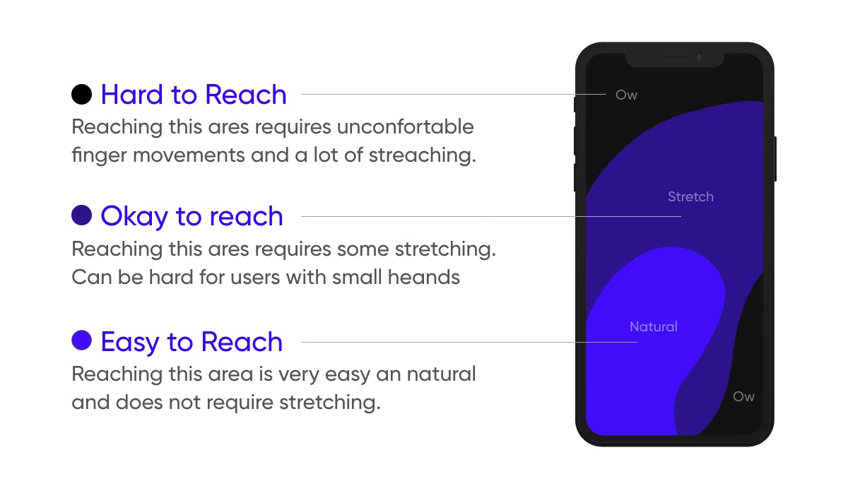
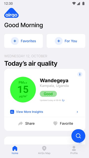
The search bar at the top of the screen vs a FAB (Floating Action Button) on the bottom right corner
Fig 1.3 The search bar at the top of the screen
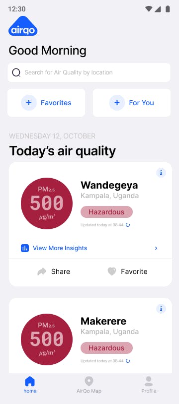
Fig 1.4 Floating Action Button in the right bottom corner

The position of the search call to action was very important in the delivery of a loveable user experience. The questions for this component were which of these two options do you prefer and why? A greater portion of the interviewees preferred the FAB. These were some of the reasons why;
It highlighted the search more,
It was easier to reach the device
It created more space at the top of the screen.
The search was easier to see.
In contrast, some of the reasons why they voted against the search bar were;
It congested the topmost part of the screen.
Having a bar there meant that the lower cards showing Air quality would be lower on the screen which would affect the user experience of users with smaller devices.
The search was too high up the screen compared to the FAB.
4.2 The contents of the “search” page.
We also tested the search page, where we asked the users to test pages that showed different types of content. This mainly aimed at finding out 1) What content was important to users while searching and 2) The layout of the content.
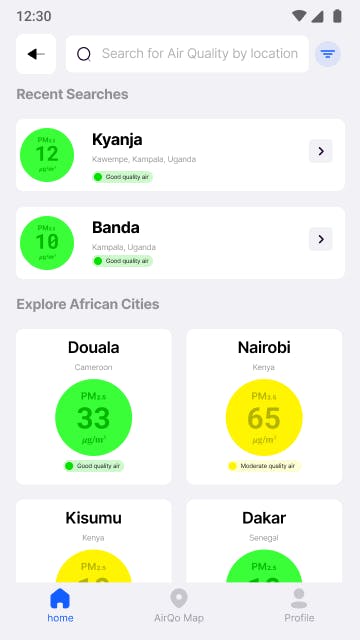
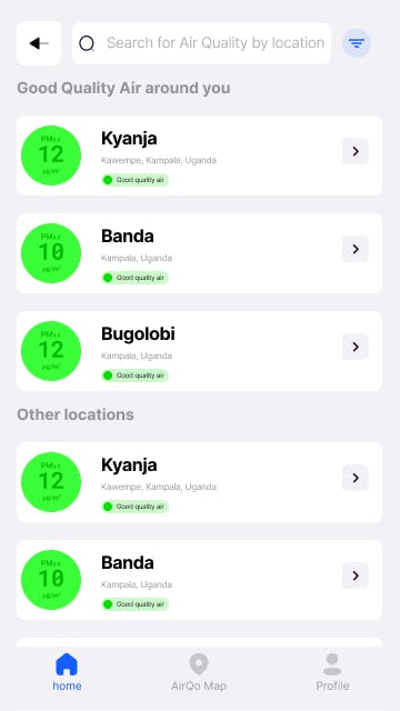
The first content option was suggestions based on the user's nearby locations Fig 1.5 and the second was Explore African Cities which prompts the users to check on the Air Quality in other African cities. Fig 1.6
Fig 1.5 Recent searches and suggested searches by location
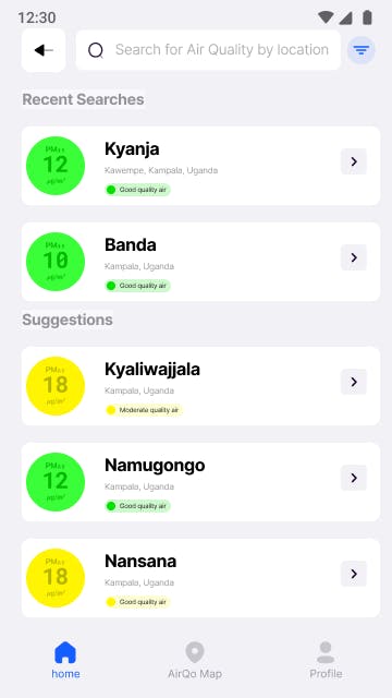
Fig 1.6 Recent searches and suggested African cities

The members preferred the Recent searches and suggested the African cities option better. This was because of the following reasons.
It connected more with the organizational vision which is Clean Air for all African cities.
It allowed users to explore the air quality readings of other African cities.
This process brought us closer to version 1 of this feature. The solution we came up with after this was based on the results of this testing.
4.3 The application of a filter
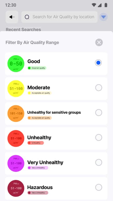
As a result of testing, users were able to interact with the “filter by Air Quality” feature and were generally impressed with the functionality.
Fig 1.6 Filter by Air Quality range

4.4 The result
Below are high-fidelity sketches of the redesigned search feature. This incorporates all the feedback and recommendations we received from the research process.
What's next
The implementation of these new changes is currently under way and will be made available to all users in the next version of the AirQo Mobile app. We can't wait for users to explore air quality data from African cities like never before.
As the AirQo design team, we commit to continuously improving the search function to accommodate more Air Quality data needs & use cases. That's it for now, breathe clean!
Download the AirQo app on the Google Play Store or Apple Store to discover the quality of the air you are breathing.
If you are a developer or a student in need of data for your project, we are your one-stop source of air quality data. Simply click here to register.
