Air quality data smoothing using Moving Averages

Engineering and technology articles for developers, written and curated by AirQo engineers
At AirQo, we collect large amounts of air quality data from different monitoring sites. This data is characterized by high frequencies which is the number of observations before a seasonal trend repeats. The high-frequency data is usually collected in seconds, minutes, hours, or days (or their fractions) which makes understanding trends in their visualization difficult.
What pattern can you describe from the chart?
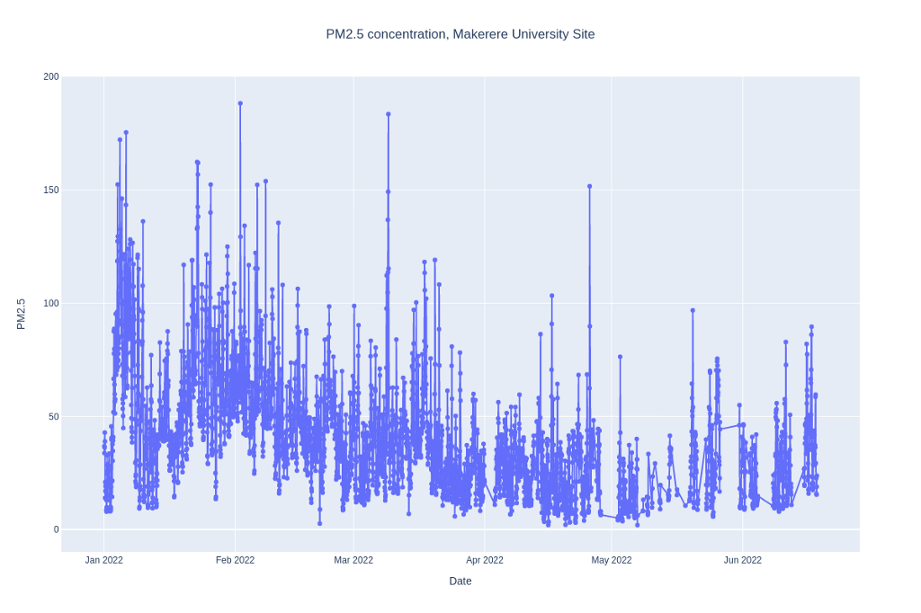
Figure 1: Time series line chart
Data Smoothing
It allows reading important patterns in data by removing noise. A major technique employed in data smoothening is the Moving Average. To achieve this, we will use pandas, a popular python library for data munging and analysis.
Installing Pandas
Pandas’ latest version can be installed through the pip command that comes with python binary or Conda for Anaconda distribution users.
pip install pandas Or conda install -c anaconda pandas
Data
Here we use the hourly PM2.5 data collected from the Makerere University monitoring site between January and June 2022.
import pandas as pd

makerere_data = pd.read_csv('makerere_university_pm_data.csv')

makerere_data.datetime = pd.to_datetime(makerere_data.datetime)

makerere_data.info()
Moving Average
Moving average is a powerful tool for spotting trends on a time series chart. It requires calculating the average of the time series data over a defined sliding window. The figure below depicts how sliding windows are formed from time series data.
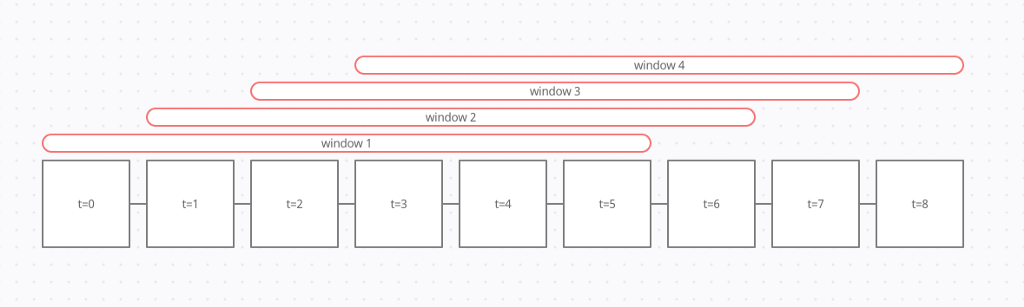
Figure 2: Sliding window
There are 3 major types of moving averages:
- Simple Moving Average (SMA)
- Exponential Moving Average (EMA)
- Linearly Weighted Moving Average (LWMA)
For simplicity, we will only consider the simple moving average.
First we need to set the index of our dataframe to the datetime column for easy analysis.
makerere_data.set_index('datetime', inplace=True)

makerere_data

We can visualize the data with the pandas dataframe plot method.
Makerere_data.plot(kind='line', xlabel='\nDate', title='PM2.5 conc, Makerere University monitoring site')
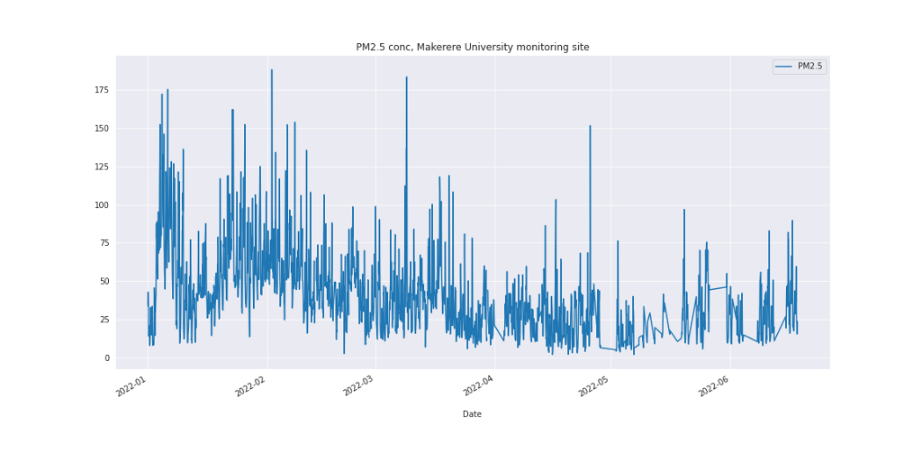
Figure 3: PM2.5 concentration
Pandas allows an easy calculation of simple moving average with its dataframe rolling method.
First we find the 24 Hour moving average, which involves finding the mean of every 24 hour data in our dataframe.
makerere_data[‘24H_moving_avg’] = makerere_data[‘PM2.5’].rolling(‘24H’).mean()
makerere_data.plot(kind=’line’, xlabel=’\nDate’, y=’24H_moving_avg’)
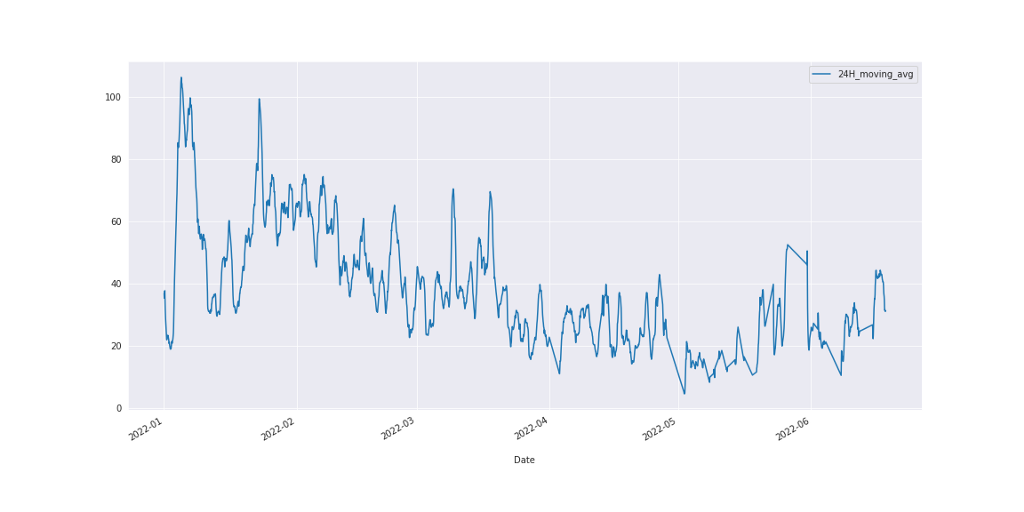
Figure 4: 24-hour moving average
Here, the trend is clearer compared to what we have in figure 3. We can go a bit further to explore a 7 Day moving average.
makerere_data['7D_moving_avg'] = makerere_data['PM2.5'].rolling('7D').mean()

makerere_data.plot(kind='line', xlabel='\nDate', y='7D_moving_avg')
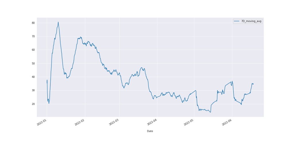
Figure 5: 7-Days Moving Average
In Figure 5 above, the noise has been gotten rid off and the pattern here can be read clearly as opposed to the previous charts.
Putting all the charts together, we have the figure below.
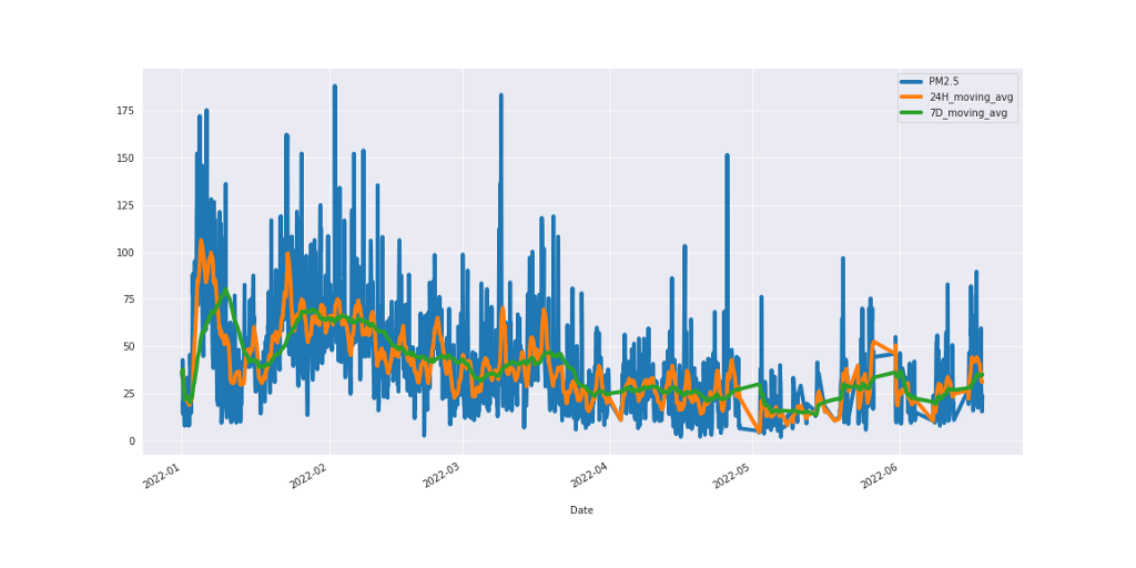
Figure 6: PM2.5 line chart with 24-Hour and 7-Day moving average.
In conclusion, moving averages are employed to remove random fluctuations, otherwise known as noise, in time series data, thereby exposing useful patterns.
The code and data are accessible here.
Explore our digital tools. Learn about the quality of air around you. Click here to get started.


